
GO
Sorry, but you already have a basket with that name. Please use something else.
Are you sure you wish to delete this basket?()
This action cannot be undone.
Sorry, something went wrong
Please report the problem here.
Create your own graphic novel characters with creator Steve Webb

July 29th 2024
With graphic novels for teens having a direct link to reading enjoyment, celebrating and affirming children's passion for graphics and comics is a must. What better way to do it than inspiring them to give it a go themselves!
Steve Webb, creator of the very silly and fun Peng and Spanners young adult fictions graphic novel series, takes over the blog to give children advice on creating their own graphic novel character. Read on to discover how he created his crime-fighting penguin and cat duo, as well as his top tips for character creation...
 |
Steve Webb | Author Steve Webb is an author and illustrator of middle grade, graphic novels and picture books. His first middle grade series was the magnificently bonkers Spangles McNasty. For younger readers he has written the fabulously silly picture book, Cows go BOO! and the rhythm and rhyme, syllable-tastic classic, Tanka Tanka Skunk. Steve lives on a muddy hill where he likes to bounce around on his mountainous bicycle. |
Get to know your characters
The appearance of any character is of course influenced by what sort of character they are. Good or bad? Human or hamster? Who is this character? What do they do? What do they want? What do they look like?
To answer the ‘What do they look like?’ question, you will need to have already decided a lot of other things about your character.
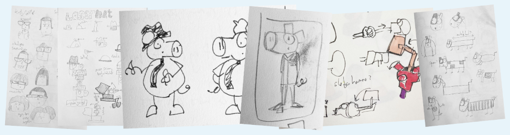
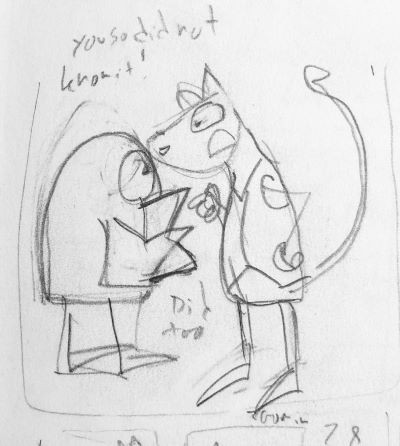
Some of Steve's secret practice sketches when creating Peng and Spanners: When Pigs Go Bad.
Creating my characters: Peng
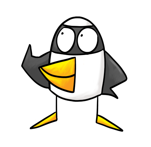
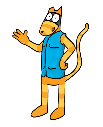
Peng was always a penguin. Peng is an adventure seeking young character, desperate to escape his boring home life.
So what should he look like? I imagined him as a penguin from the start as I wanted him to be an unlikely looking superhero and funny. Penguins have a fun, comical appearance already in reality, and they are birds who can’t fly. They live on the Antarctic coasts, in barren landscapes. This, I decided, was all perfect for my superhero, adventure seeking character.
Peng was initially completely square! I really liked his square shape. I kept drawing him leaping around, trying out his Ninja moves, rolling like a dice.
Think about your audience
BIG BUT ALERT!
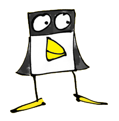
BUT, you have to always remember who you are writing and drawing for. Your audience is not you. They don’t know what you’re thinking. Will everyone instantly know that this little square character is a penguin? Will the fact that he is square make people think: "Hmmm… this is really weird? Why does this character have corners on his head and the others don’t?"
I have a habit of going too far sometimes, being too silly! This is fabulous and fine in the early stages of picture book writing and designing your characters. You can always undo the bonkers a bit when you’ve gone too far. This is exactly what I did with Peng.
I drew him a bit more realistically, but only a bit. After all, you can bend the rules as much as you like in your creations for comics for teens and younger audiences. Just remember that your audience has to get it too. It’s not just for you. You can have square characters if you want, as long as there’s a reason for them to be square. It has to make sense, or your readers won’t understand.
Creating my characters: Spanners
Spanners actually started out as a rat! Spanners didn’t have to be a student at the school really. He could have a different reason for being there. Rats can live pretty much anywhere, so this also seemed a good fit. Spanners the rat could have made himself a home in the school grounds. So, he started out as a rat.
However, I soon realised there might be problems with Spanners the rat. Apart from being a bit ‘EWWWWW, a rat!’, people (remember your audience!) might be afraid of rats. Also, he looked very similar to a mouse. Is that going to be confusing?
Mice and rats are actually very small compared to people and penguins. That was a major problem. Spanners is with Peng most of the time and also lots of other characters, who are probably all going to be bigger than Peng. If there’s a human character in a scene with Spanners the rat, Spanners should be about the size of the human character’s foot. There’s way too much of size difference! Will the reader be able to see the expression on Spanners’ tiny face in that drawing? Nope. And when I started adding giant robots to the story (in book 1)... Nope, it just wasn’t going to work.
To solve this, Spanners became a cat instead. Cats have a natural intelligent look about them too, which fits his character better. AND, they’re much bigger than rats!
Design little details to bring your characters to life
So, Spanners became a stray cat who has made himself a home at the school and meets Peng. Perfect.
I also initially gave Spanners a tool belt holding a few tools, but soon realised it would be better to give him something bigger so he could carry more tools and not show them all the time. What about a bag? Or a jacket with pockets? I decided on a waistcoat!
I chose to make Spanner's fur orange to keep the colours bright and lively, rather than brown or black. He’s stripey, but not too stripey. Don’t forget you have to draw your characters lots of times and they need to be exactly the same every time! I gave Spanners a specific number of not many stripes to keep it simple.
I also decided the top of his right ear is missing. This is so that he can make up stories about what happened to it, which really annoys Peng. Little details can really help bring your characters to life. I made him taller than Peng to emphasise Peng’s comical, un-superhero-ness and Spanners’ intelligence.

Experiment with your characters and have fun!
There’s a lot of experimenting involved with character design in exactly the same way as there is with writing and re-writing, until you get it right. Don’t be afraid to change what you initially thought was THE BEST thing you’ve ever drawn in your whole life! If it needs fixing, fix it. Change it and then change it again if you have to.
Be bonkers and then maybe be a bit less bonkers. And then be bonkers again!
-
Ask yourself questions about your characters' personality to generate drawing ideas.
-
Be silly when you first draw your character. You can tone it down later!
-
Think about other people who will read your graphic novel. Do your character design choices make sense?
-
Add specific but simple visual details to make your character unique but easy to redraw.
-
Don't be afraid to try new ideas and change your character design as you get to know them.
-
Be bonkers!
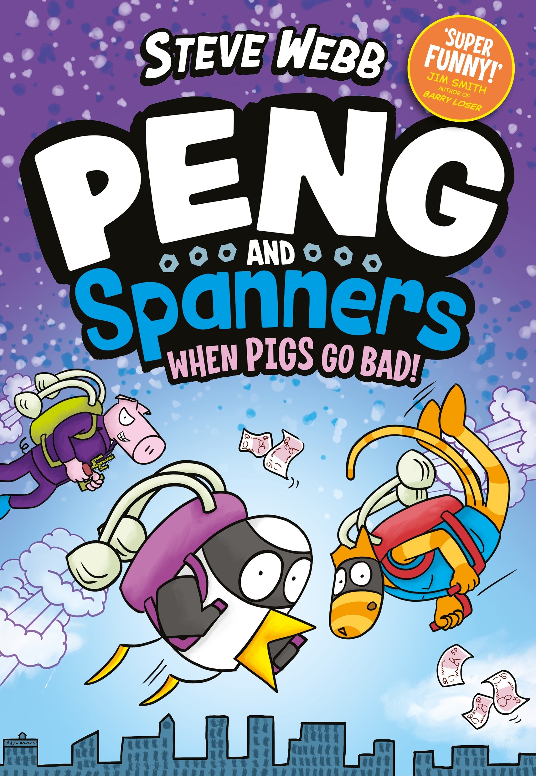 |
Peng and Spanners: When Pigs Go BadThere’s evil afoot in the form of the rich but bored architect, Mr Big the pig. He has plans to steal Peng’s superhero gadget collection! When half of Spanners’ latest inventions go missing and he and Peng get blamed for several dastardly crimes, the superheroes realise they need to kick into action... but are they all about to be out gadget-ed, and can they stop arguing for long enough to find out?! £7.39 Save 26% |
|
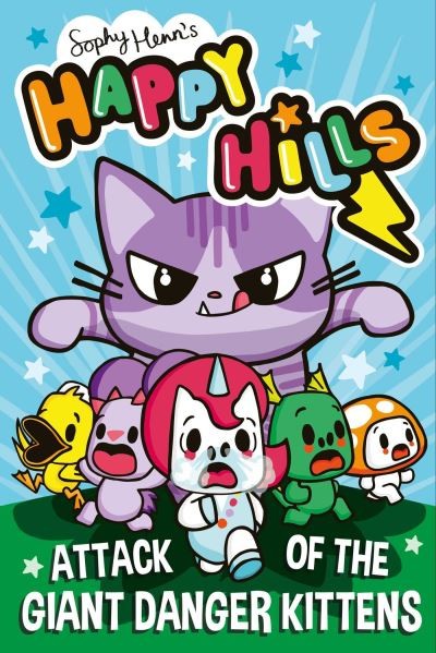
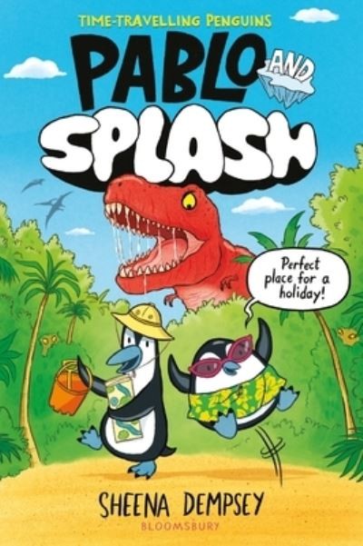
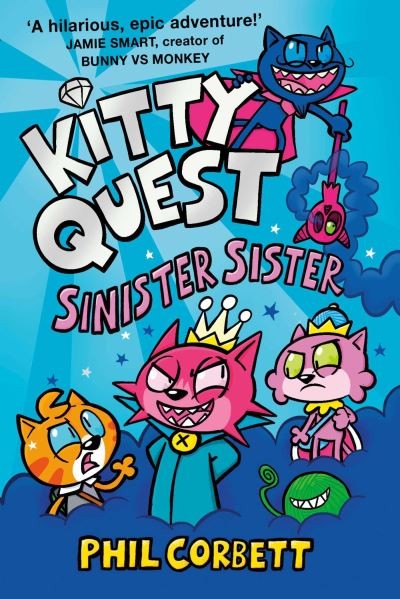
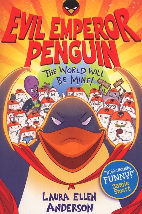
Check out our top graphic novel for teens to inspire character creations:
 |
 |
 |
 |
 |
| 📚 DISCOVER MORE YOUNGER GRAPHICS |
|
|
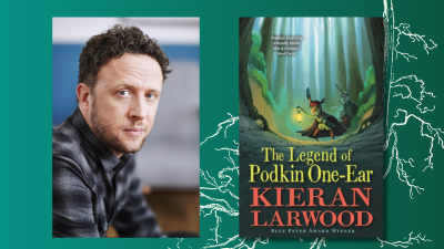
Read next:Creating your own fantasy world with author Kieran Larwood |
|
 |
- hello@peters.co.uk
- 0121 666 6646
- Send a message
- Meet the team
- Peters Ltd
- 120 Bromsgrove Street
- Birmingham
- B5 6RJ


")